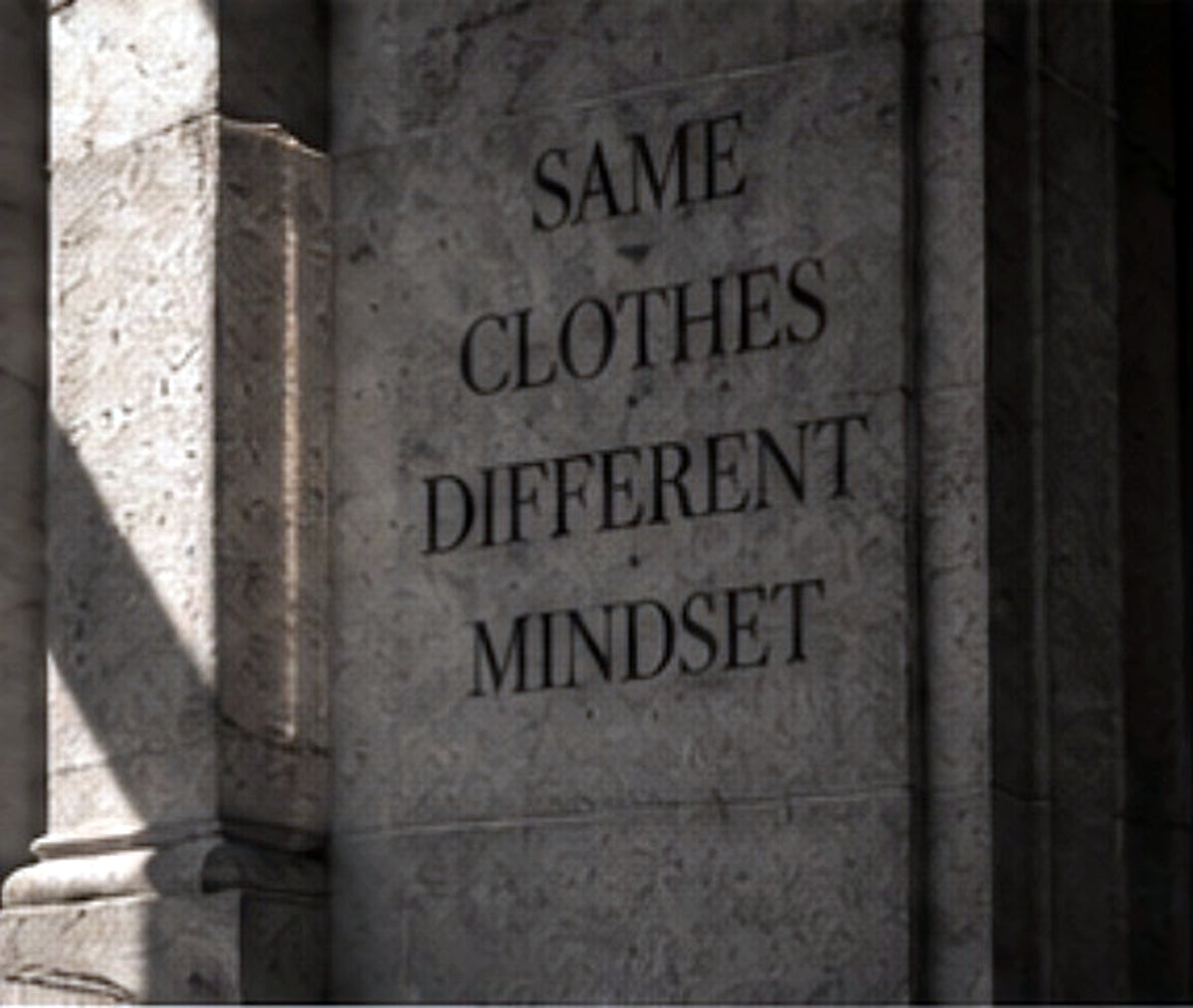
Not for everyone. That’s the point.
BARE BONES is built around a simple design decision: remove what does not earn its place.
That means fewer colors, fewer messages and fewer surfaces fighting for attention. The result is not minimalism for its own sake. It is a way of making the remaining elements matter more.
1 / The garment comes first
Before artwork, there is weight, drape, collar, sleeve volume and proportion. A graphic cannot rescue a base that feels weak.
2 / Contrast should do the work
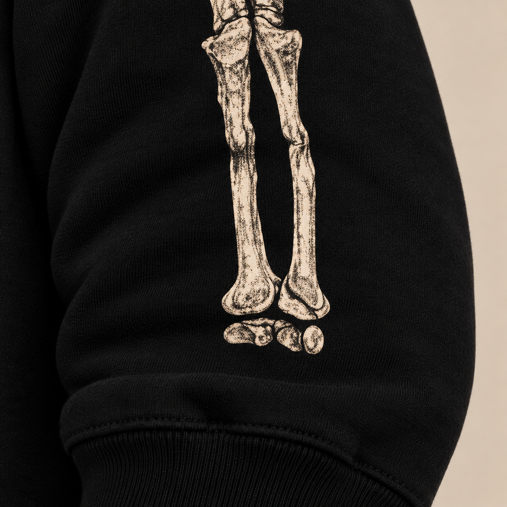
Black and bone tones create enough tension without needing a stack of effects. The palette stays controlled so the image can remain direct.
3 / Empty space is part of the design
A clean back is not unfinished. It gives the front and sleeves room to carry the idea. Filling every surface would make the same artwork feel less important.
4 / The reference should outlive the occasion
Anatomy can acknowledge darker cultural references without becoming seasonal merchandise. The question is always whether the piece still makes sense months later.
5 / Confidence does not require consensus
A clear point of view will naturally exclude some people. That is more useful than designing for universal approval and ending up with something nobody remembers.
The Anatomy Crewneck — Heavyweight is the first expression of those rules.